Web Design in Balance: When Aesthetics and Functionality Go Hand in Hand

Web Design in Balance: When Aesthetics and Functionality Go Hand in Hand
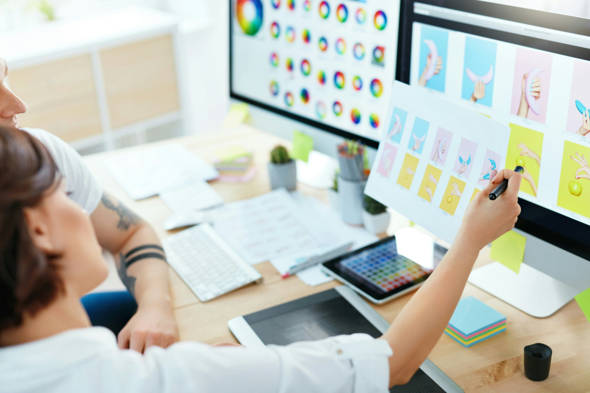
A well-designed website is like a finely tuned orchestra – every element must work in harmony. Colours, typography, imagery, and structure should not only look appealing but also serve a clear purpose. In an age where we move seamlessly between screens, finding the balance between aesthetics and functionality has become a defining skill for anyone working in digital design.
Why Balance Matters
A visually stunning website can capture attention, but if users struggle to navigate it, the appeal quickly fades. Conversely, a purely functional site that lacks visual interest can feel uninspiring and fail to engage visitors. The best user experiences arise when form and function complement each other – when design is both intuitive and inviting.
A well-crafted website should not only impress but also guide. It should be easy to navigate, quick to load, and accessible to everyone – regardless of device or ability. The goal is to create an experience that feels natural, meaningful, and effortless.
Aesthetics as Communication
Aesthetics are not just about taste; they are about communication. Colours, shapes, and typography convey messages about who you are and what you stand for. A minimalist design might suggest professionalism and calm, while a bold, colourful layout can express creativity and energy.
When used thoughtfully, aesthetics become a language that speaks to users before they read a single word. Design choices should therefore always reflect the target audience and the message you want to convey. A website for a London law firm should not feel like one for a creative agency in Shoreditch – and vice versa.
Functionality as the Foundation
Behind every beautiful website lies a solid technical foundation. Functionality is about everything the user might not see but certainly feels: fast loading times, logical navigation, clear buttons, and a structure that makes information easy to find.
A good starting point is to think in terms of user journeys: what should the visitor be able to do, and how can you make that process as simple as possible? Whether it’s finding contact details, booking a service, or completing a purchase, the fewer obstacles there are, the better the experience.
Responsive design is now a given – your site must perform equally well on mobile, tablet, and desktop. This requires flexible design thinking and thorough testing across devices and browsers.
Læs også:
The Interplay Between Design and User Experience
When aesthetics and functionality meet, we get what’s known as user experience (UX) – the sum of every impression a visitor has, from the first click to the final action. Great UX design is built on empathy: understanding what users need and helping them achieve it with ease.
Sometimes, it’s the smallest details that make the biggest difference – a clear “back” button, a friendly error message, or a subtle animation that confirms an action. These touches build trust and make the experience feel smooth and human.
Finding Balance in Practice
Achieving balance in web design requires both creativity and discipline. Here are a few principles to guide the process:
- Start with purpose – What is the website meant to achieve? Let the design support that goal.
- Think like a user – Test early and often. What feels obvious to you may not be intuitive to others.
- Simplify, don’t complicate – A clean, focused design makes navigation easier.
- Use hierarchy and contrast – Make it clear what matters most on each page.
- Stay consistent – Reuse colours, buttons, and typography so users feel at home.
When aesthetics and functionality receive equal attention, the result is a website that not only looks good but works beautifully – a place where users feel welcome, guided, and understood.
Web Design as a Living Process
A website is never truly finished. Technologies evolve, user expectations shift, and new design trends emerge. Web design should therefore be seen as an ongoing process of refinement, testing, and improvement.
The balance between aesthetics and functionality is not a fixed point but a continuous movement. It’s within this movement that the most engaging and effective digital experiences are created – where beauty meets purpose, and design truly comes to life.
Læs også: